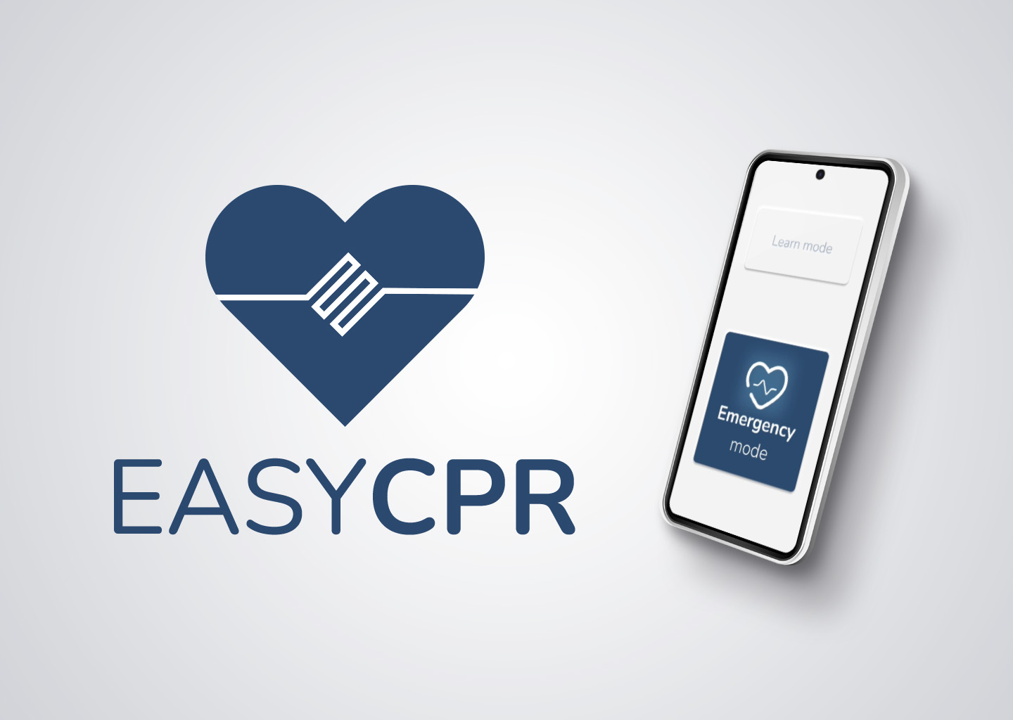
1. Introduction
Every minute counts in a cardiac emergency. Easy CPR is an app designed to help any adult perform cardiopulmonary resuscitation (CPR) quickly, easily and effectively. With clear, real-time instructions, this app turns any user into a potential lifesaver.
2. The challenge
Many people do not know how to react to cardiac arrest. Lack of knowledge, fear of action and uncertainty about what to do can cost lives. My challenge was to create an accessible and easy-to-use tool that guides users step-by-step through the correct application of CPR, even in times of great stress.
3. My solution
As a UX designer, I have created an intuitive application that:
- It provides clear and guided instructions in real time.
- It integrates a metronome to indicate the correct compression rhythm.
- Locate the nearest automated external defibrillator (AED).
- Works offline in emergency situations.
4. The process
Research and discovery: Research and discovery: We analysed the main barriers people face when performing CPR and consulted medical experts. We conducted remote questionnaires with five participants aged 35-55 years.
Empathy
The following empathy map was obtained (click to enlarge)
User persona (click to enlarge)
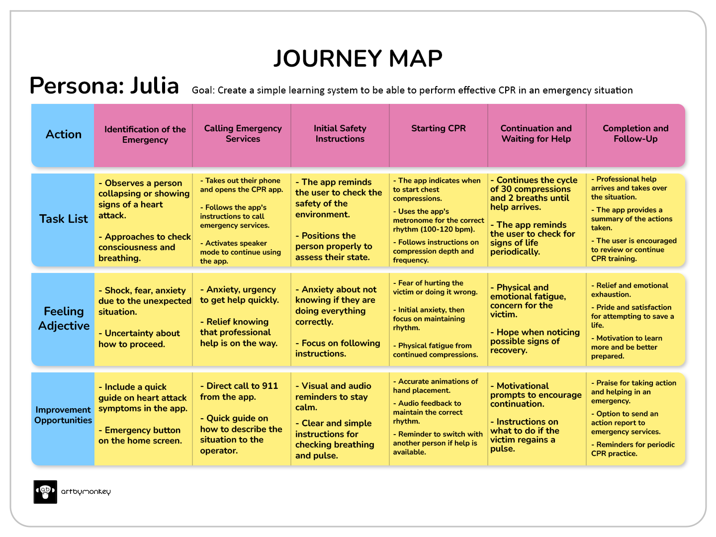
Journey map for an emergency situation with a myocardial infarction victim
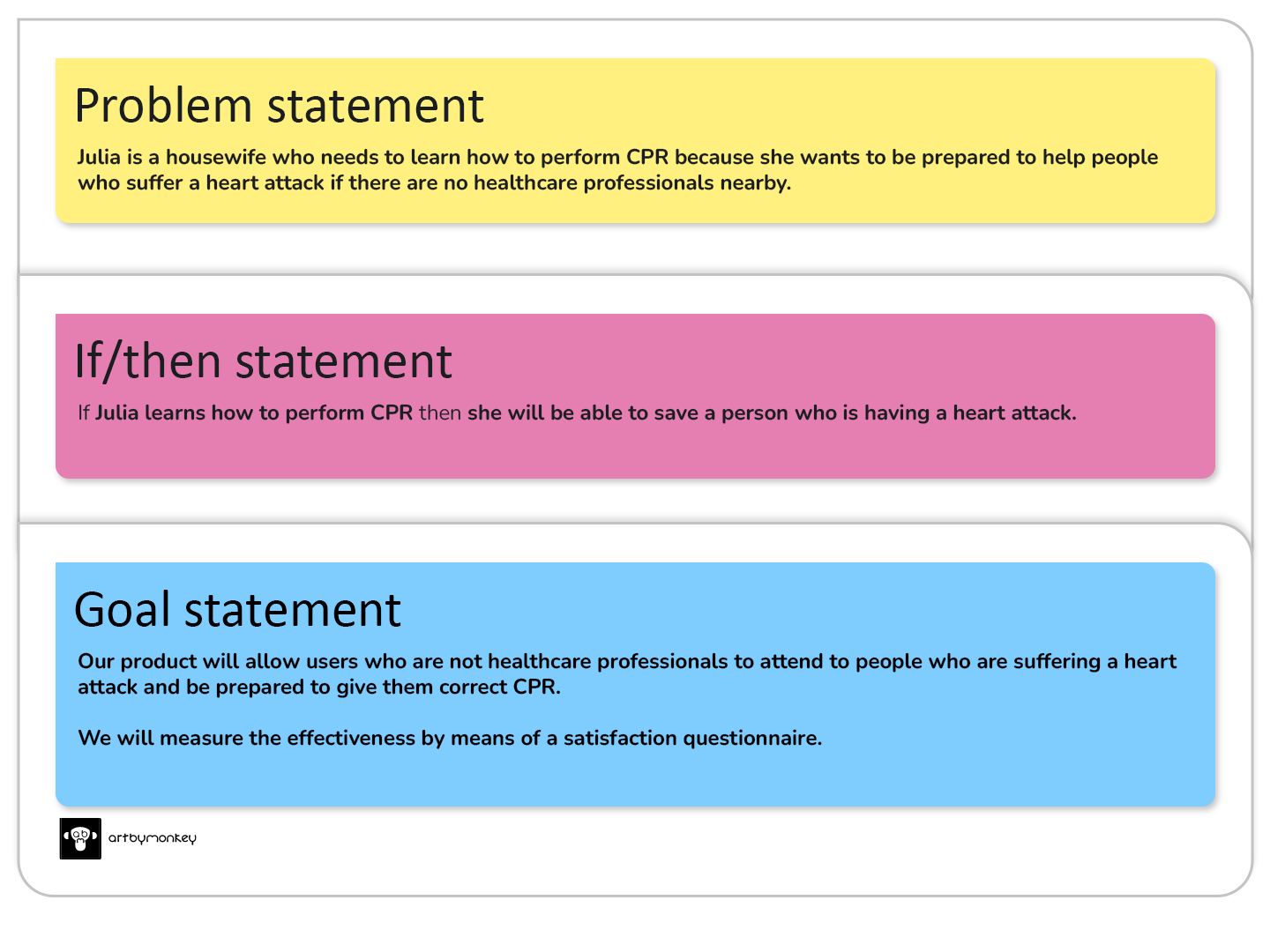
With the information obtained throughout the empathy process, we can define the problem and the solution.
Define
The competitor product research will help us to understand what products are on the market and how they could be improved.
Ideate
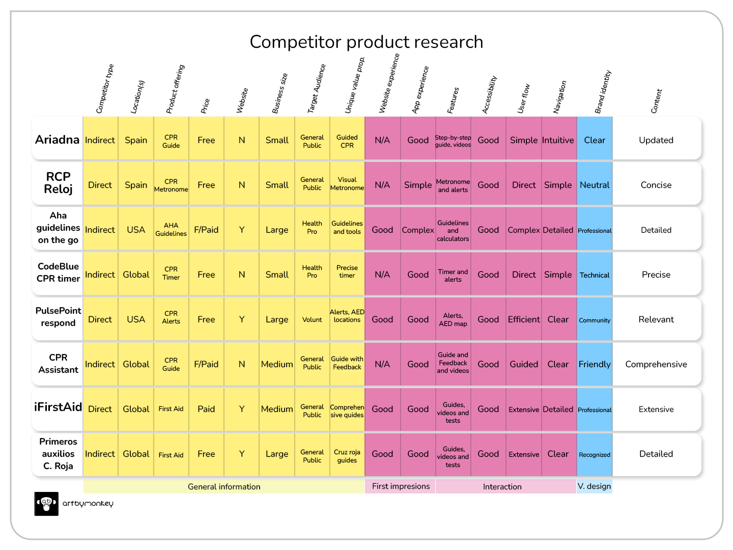
Having analysed the list of possible competitors, it is now time to choose the most interesting features and try to improve them in our future app.
In short: the ideal app would combine the simplicity and accuracy of ‘CPR Watch’, the alerts and geolocation of ‘PulsePoint Respond’, and the comprehensive instructions and feedback of ‘iFirstAid’. It would also incorporate additional features to enhance the user experience and increase the effectiveness of CPR.
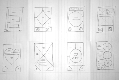
Quick sketches, simple ideas to create a basis for what the application could look like.
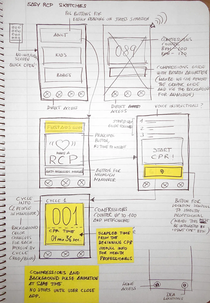
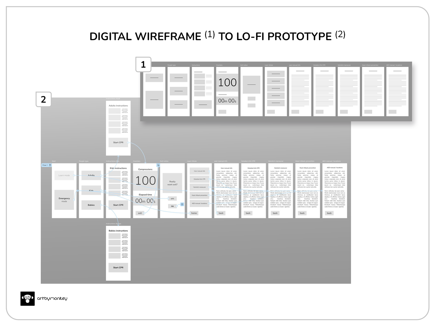
I outline the end-to-end steps of the ideation process using storyboards. I use a sitemap and user flows to internally structure the application. I use wireframes to visualise the initial design and, finally, the low-fidelity prototype.
Prototype
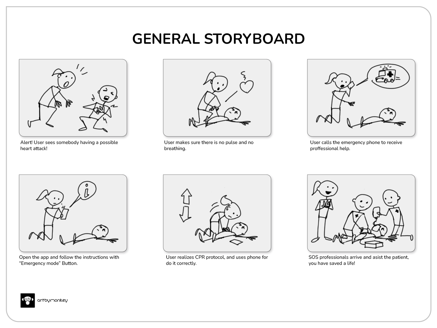
Overview of the event representation
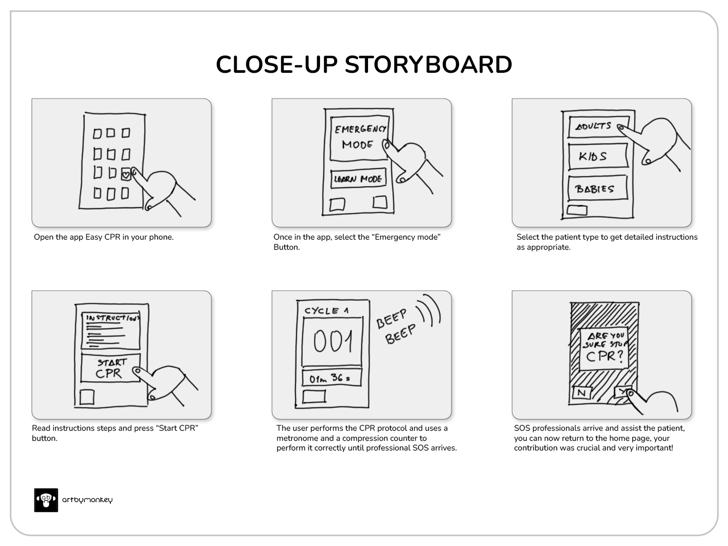
Detailed view of the use of the application during the event
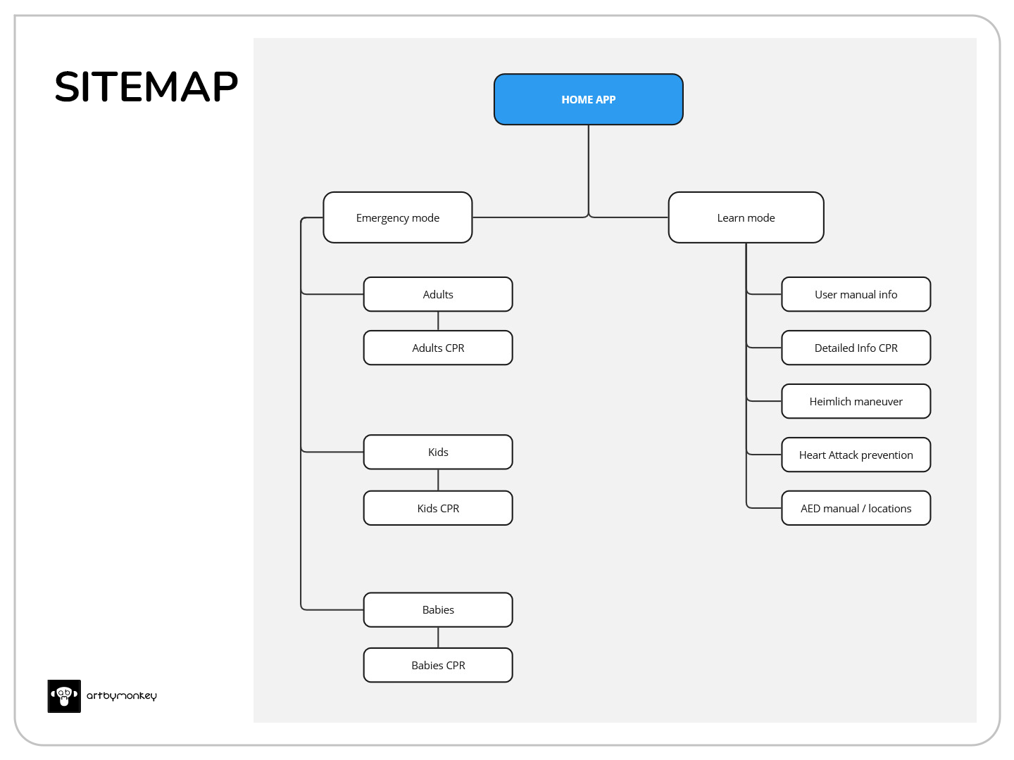
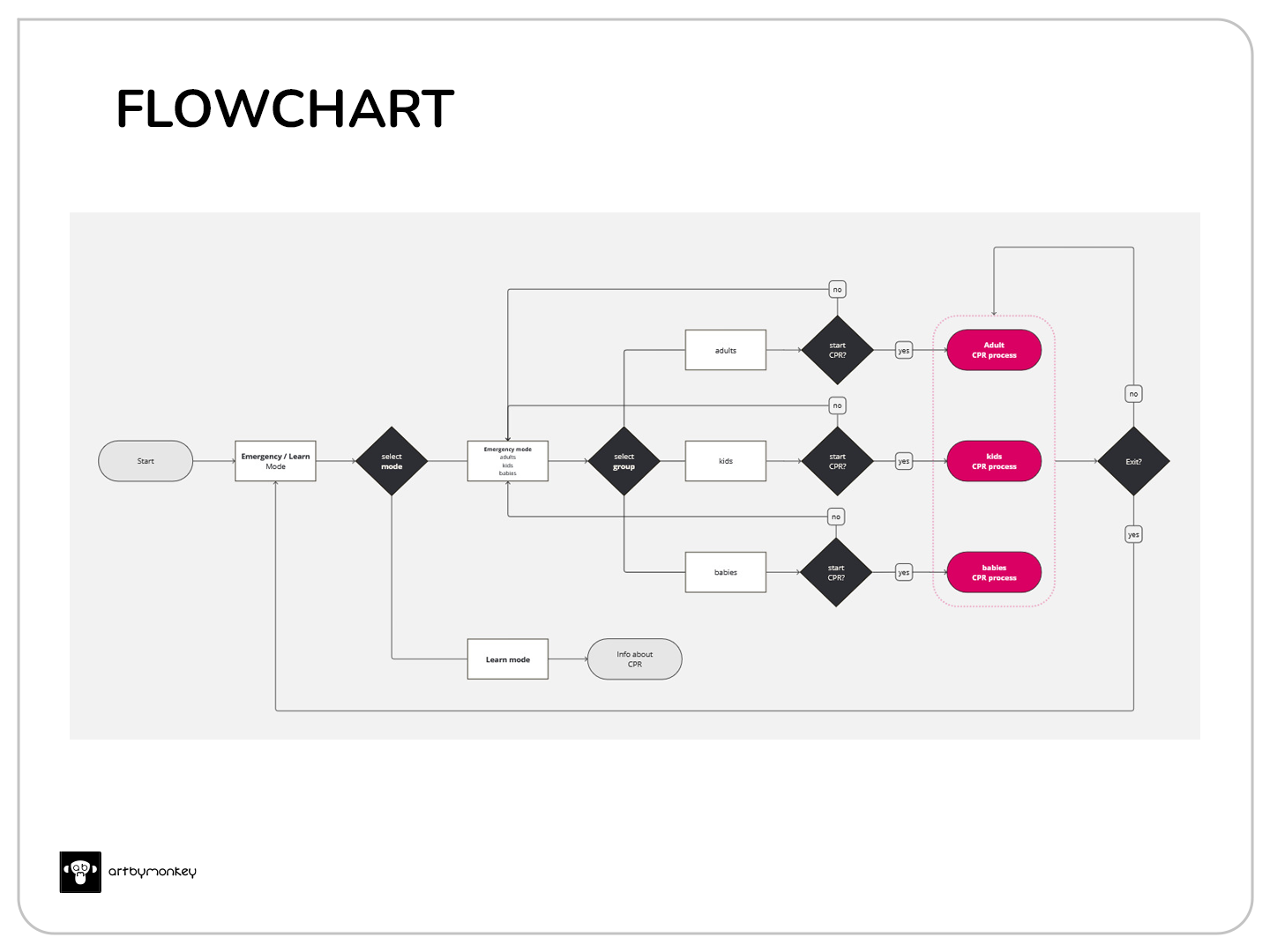
The internal structure is extremely simple, requiring quick and undistracted use. The learning mode allows additional information to be added at a later stage and is a section exclusively for reinforcing knowledge.
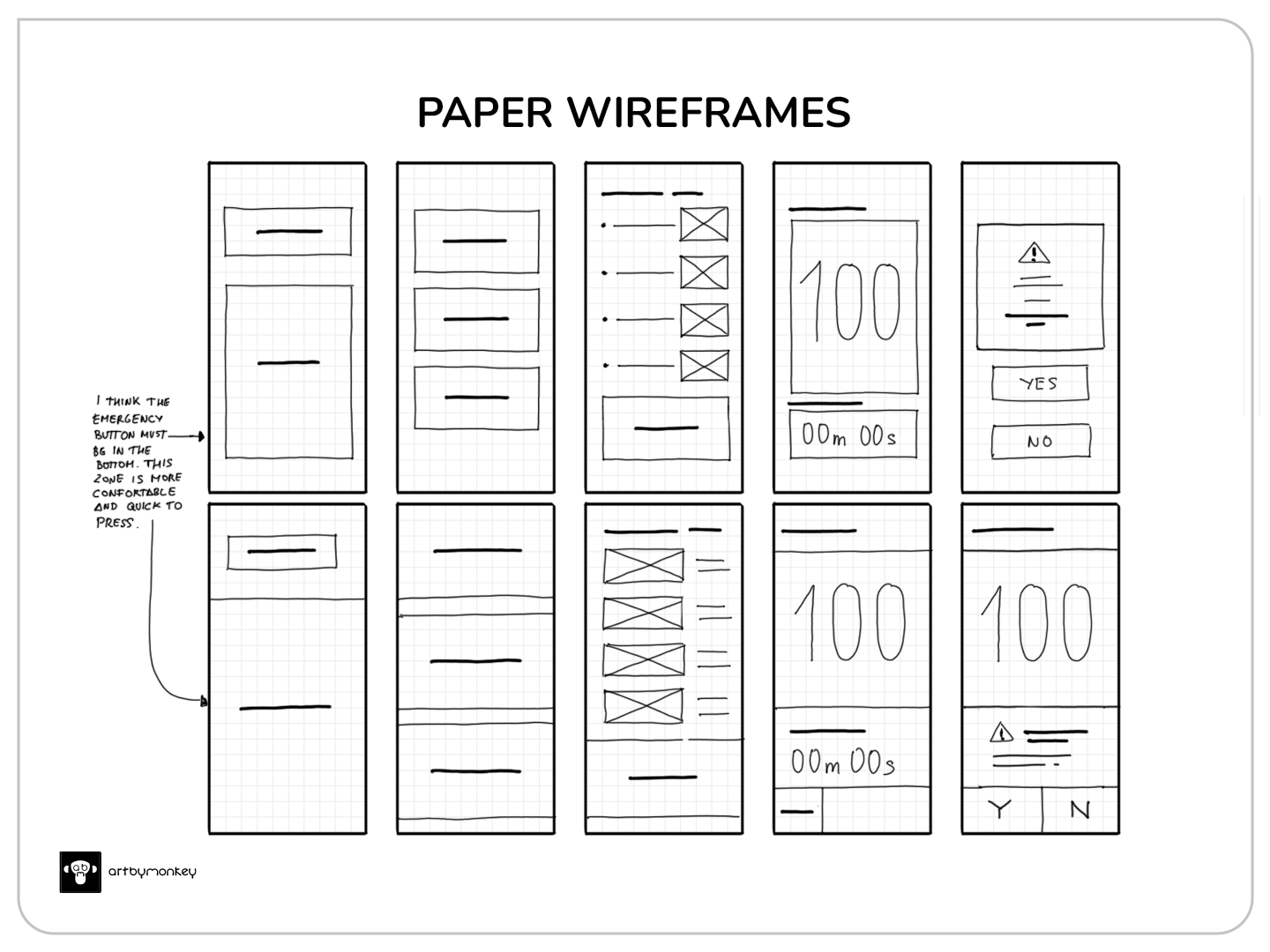
In early wireframes, the option to place the emergency button at the bottom of the screen makes sense; it is the area closest to the thumb if we use the phone with one hand.

A high-fidelity prototype with all active functions, animations, sounds and timers is prepared. On the age selection screen, the ‘Adult’ button is positioned in the same way as the emergency button, i.e. under and near the thumb, taking into account that the percentage of heart attacks is much higher in adults and rarely occurs in children and infants.
Time for the test and usability study.
Test
The usability study is planned for a maximum of 5 people of different ages and locations. Of the first 3, one will be moderate and the remaining 2 will be unmoderated. Two applications are provided:
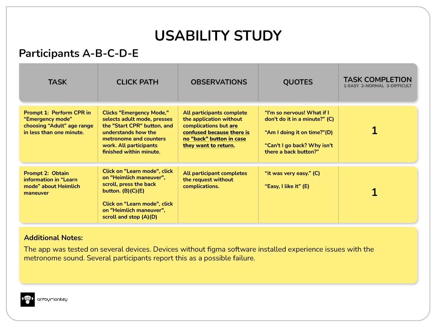
Applications are made correctly and smoothly. Some notes identify common patterns:
- It was observed that 5 out of 5 participants needed a ‘back’ button on the instruction menu within each age section. This means that they feel confused because they cannot go back to the previous screen or exit quickly when they want to.
- It has been observed that all participants fully understand the use of the application. This means that they know how to use it.
Performance-based design iteration (Modification)
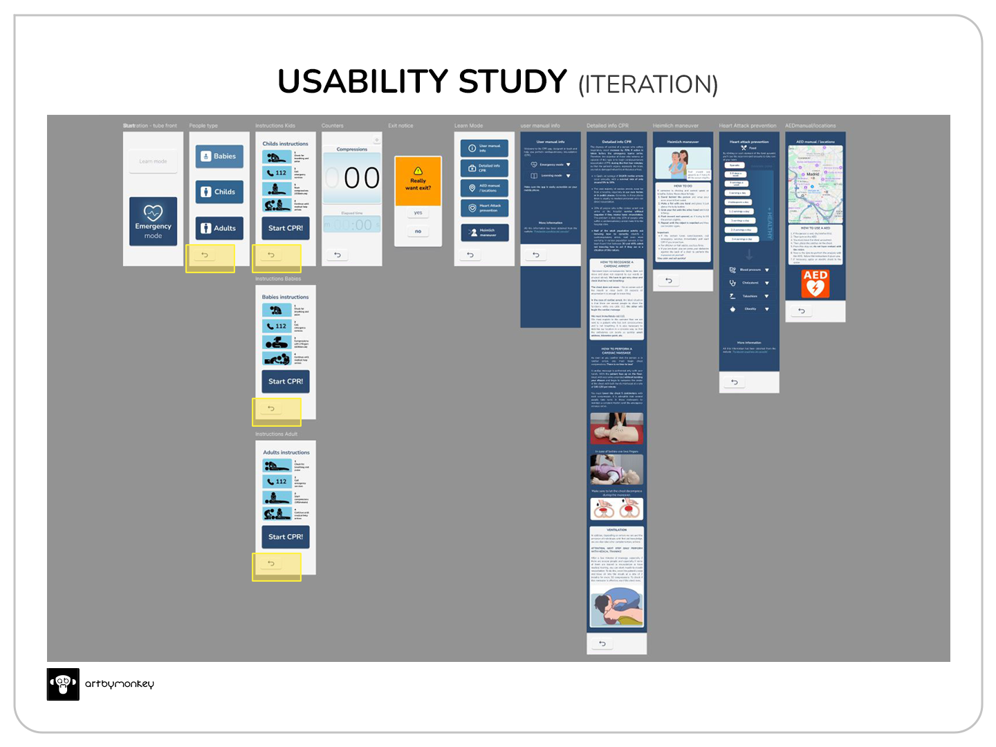
Back buttons are added to confusing screens (yellow boxes) and text is replaced by icons to maintain consistency across all sections.
Here you can see the final result:
Want to test easy museum? Click below.
Nothing will be downloaded to your phone or computer; the prototype will simply open from Figma. The sound function may not load correctly if you do not have Figma on your phone.
Accessibility considerations
- Accessibility has been taken into account, meeting the W3C contrast standard. However, the timer would need an additional feature to highlight it without distracting attention.
- With the help of the developers, a better synchronisation between sound, animation and counters could be achieved. In the prototype, Figma sometimes does not solve this small problem.
Next steps
- Implementation of real-time digital voice guidance in several languages.
- Notification of elapsed time by voice or audio message for each elapsed minute
- Automatic call with location notification to emergency services.