1. Introduction
Project to create a museum app to view and obtain information on exhibitions and schedule visits.
2. The challenge
Develop an intuitive mobile application that allows users to browse the exhibitions available at their favourite museum, book their visit and pay for tickets easily and efficiently. This project represents the first exercise in Google's UX design certification programme.
3. My solution
As a UX designer, I designed an application to offer a smooth and pleasant experience to users:
- Clear interface, with well-organised and understandable options.
- Colours, fonts and visual elements guide the user without overwhelming them.
- The application is accessible for people with disabilities, and includes options such as readable text and screen reader support.
- Booking and payment are done in a few easy steps, without any lengthy or confusing processes.
4. The process
Research and discovery: The user research conducted was based on interviews with 5 users aged 16-44.
Empahty
The following empathy map was obtained (click to enlarge)
User persona (click to enlarge)
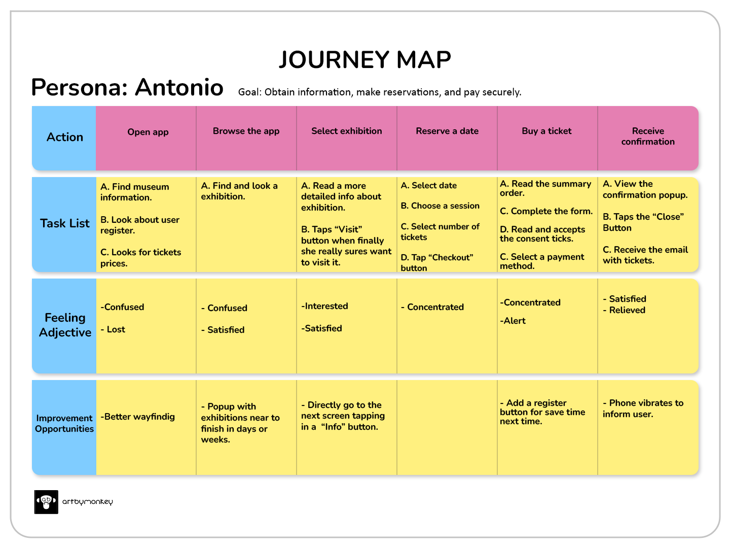
Journey map to plan, book and buy tickets to the museum.
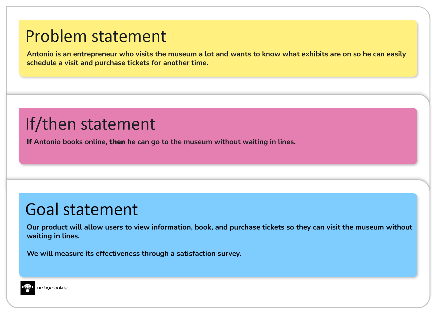
With the information obtained throughout the empathy process, we can define the problem and the solution.
Define
The competitor product research will help us understand what products are on the market and how they could be improved.
Ideate

Having analysed the list of possible competitors, it is now time to choose the most interesting features and try to improve them in our future app.
In summary: our application should combine the key features of the sites we have analysed, including functionality, accessibility, navigation and intuitive user flows.
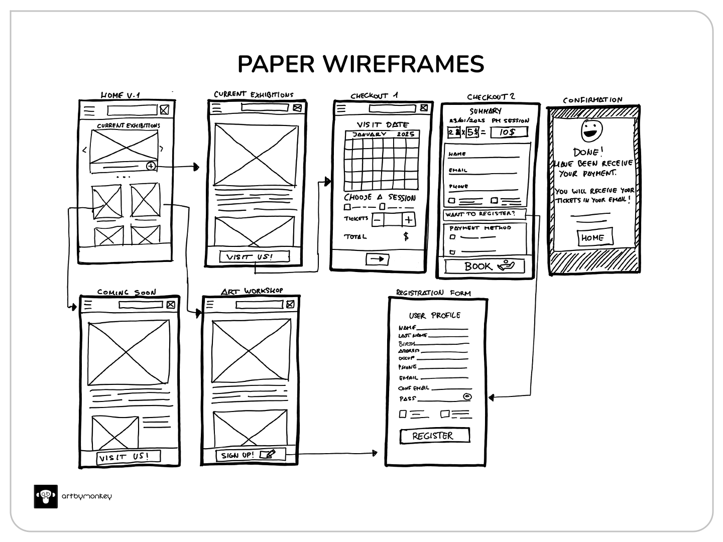
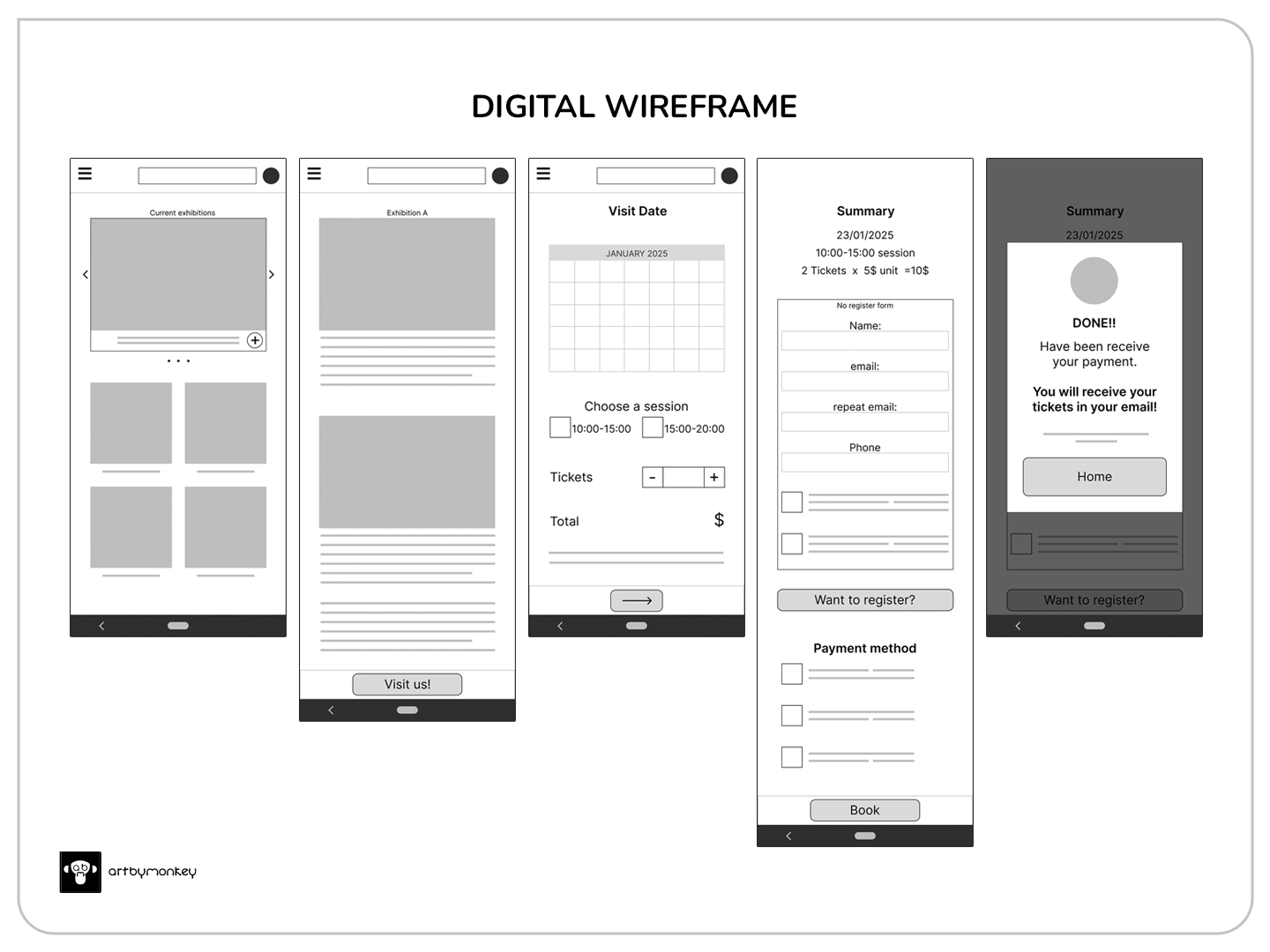
I outline the end-to-end steps of the ideation process using storyboards. I use a sitemap and user flows to internally structure the application. I use wireframes to visualise the initial design and, finally, the low-fidelity prototype.
Prototype
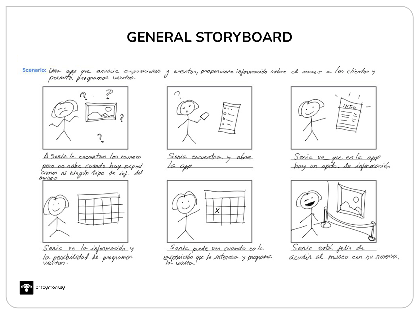
General representation
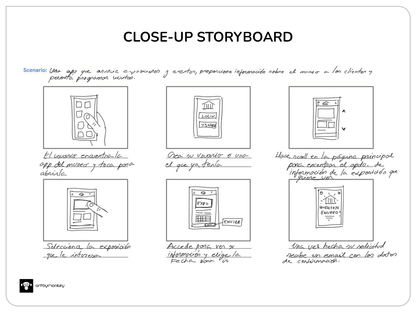
Detailed view of the application
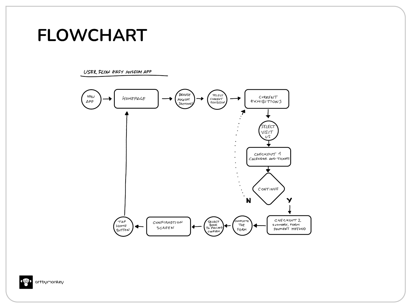
User flow focuses on exhibitions, booking and ticket purchases.
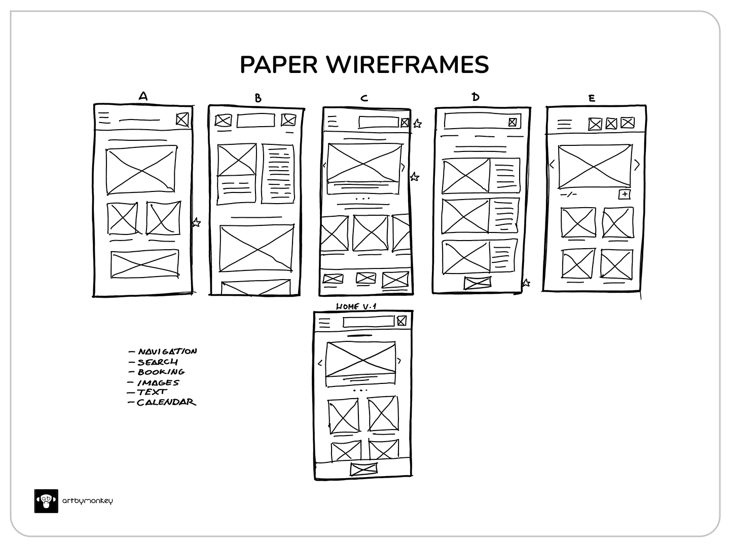
We create the home screen from at least 5 designs, and then sketch a first version of the rest of the screens.

As we built the low-fidelity prototype, we modified the initial design to improve the user experience by eliminating the vertical scrolling of the home page, giving us a quick overview.
Time for testing and usability study.
Test
The usability study is planned for a maximum of 5 people of different ages and locations. Of the first 3, one has been moderated and the remaining 2 unmoderated. Two requests are provided:
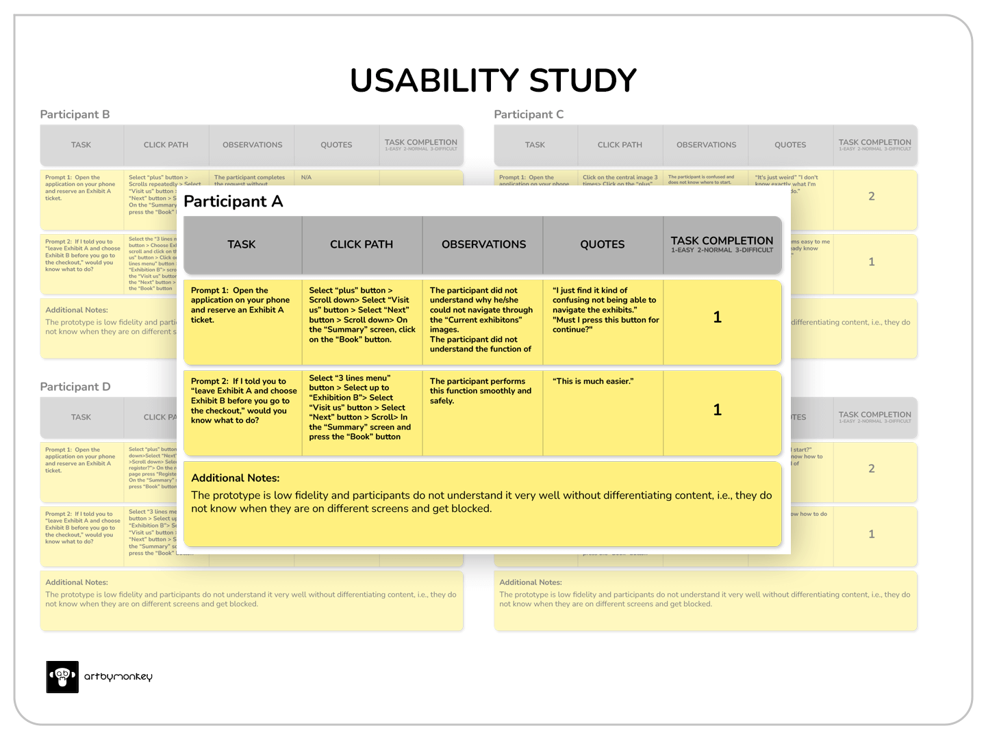
It has been found that most participants do not know how to proceed:
- 4 of the 5 participants would like the selection of exhibitions to be more straightforward.
- Almost all participants needed help to continue.
40% of participants do not know whether or not to click to complete the booking:
- 2 of the 5 participants were not clear on what to do with the ‘Register’ button.
Performance-based design iteration (Modification)
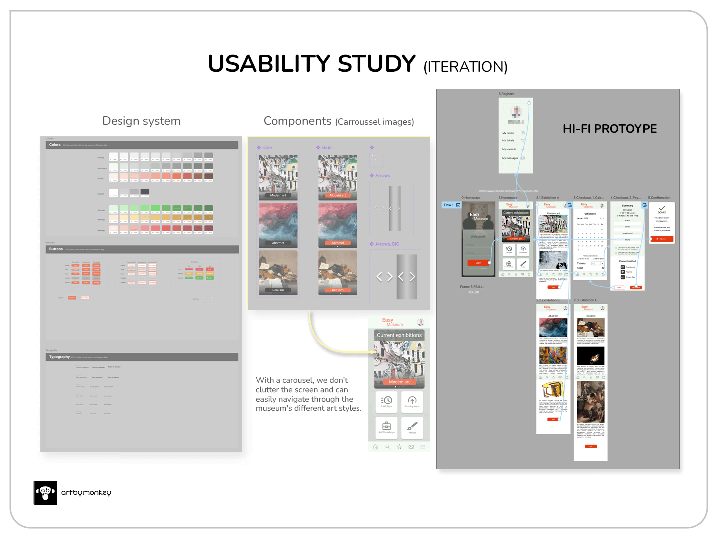
Based on the weaknesses identified in the results of the usability study, the following changes were introduced:
- Acall to action button was added to each image in the top carousel.
The ‘Register’ button has been made secondary, so that it appears as an option without distracting attention.Update: This has finally been removed and replaced by a question to the user when starting the application.- Shortcuts are added at the bottom such as: back to home page, search, bookmarks, messages and calendar.
Here you can see the final result:
Want to text the prototype? Click below
Nothing will be downloaded to your phone or computer; the prototype will simply open from Figma. The sound function may not load correctly if you do not have Figma on your phone.
Accessibility considerations
- Accessibility has been taken into account, complying with the W3C contrast standard.
Next steps
- Update the workshops section with the available courses.
- Add links to instructional videos on artists, styles, etc.
- The use of virtual tours would be an interesting feature for people who cannot visit the museum.